Tsuita
A match-up ride sharing app
designed for students 📱
Overview
Students in Ann Arbor area are suffering from the current commute system. This project aims to solve the problem by connecting people who drive and people who need a ride together.
My roles
Product Designer (Solo)
Design tools
Figma
Duration
September 2019 - December 2019
ProblemThe frustrating commute
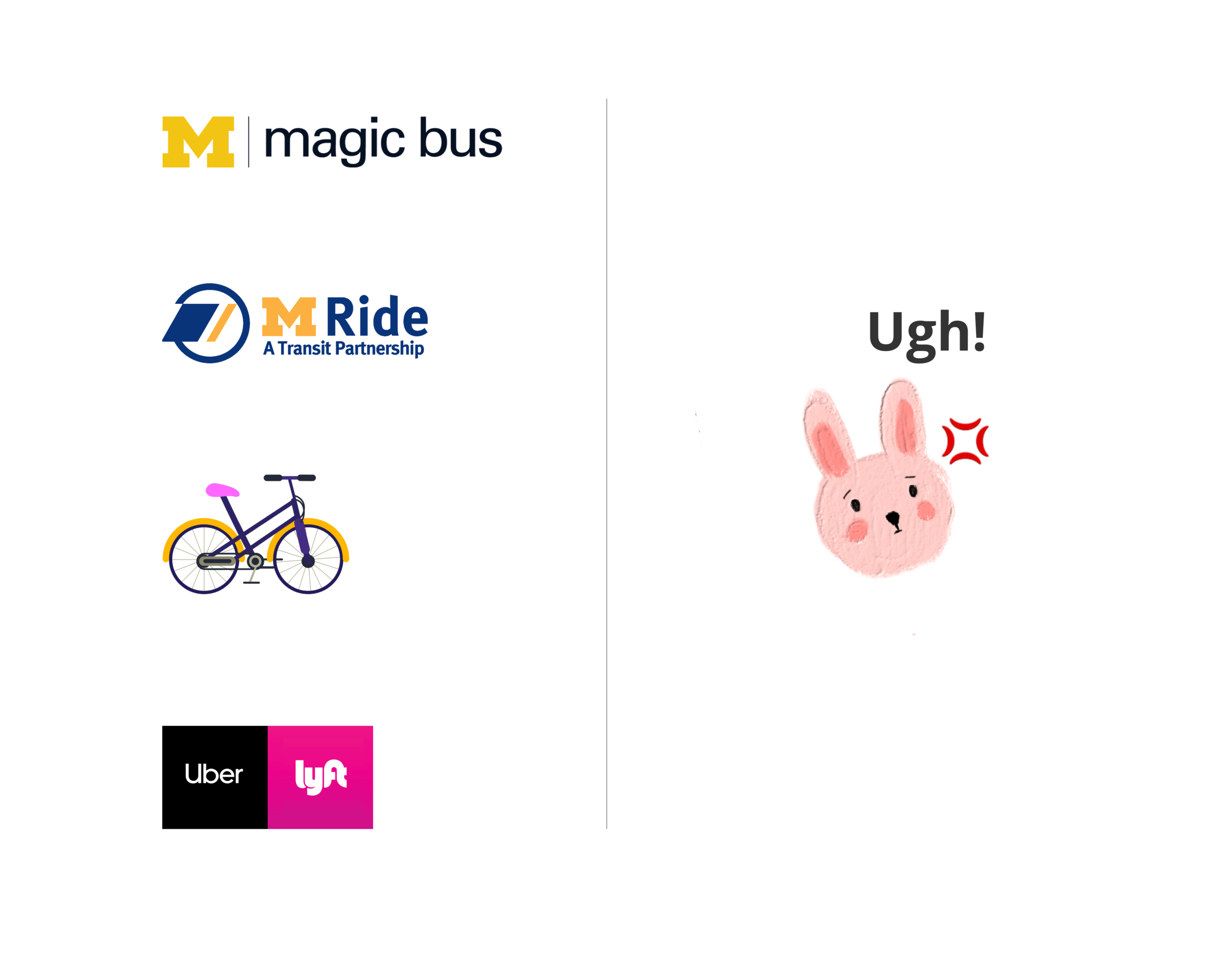
Currently, students in Ann Arbor who live off the main campus and without a car mostly use bikes, Blue Bus (School bus), and The Ride (the public transit system in the Ann Arbor area) as their routine transportation means.
However, although both Blue Bus and The Ride are free of charge for students, they are experiencing high passenger volume due to the considerable number of students, plus the fact that buses can’t always follow the schedule because of the traffic, the experience of public transit in Ann Arbor is less than satisfactory. Biking won’t be a good choice during winter times, either. Uber and Lyft are available in the area but the cost would be an obstacle.
rESEARCHInterviews
In order to locate pain points and build empathy with the target audience, I conducted five semi-structured interviews with students who live off-campus.
Key Takeaways 🔎
Students without a vehicle are experiencing anxiety and frustrations due to the uncertainty of the bus schedule, endless waiting, as well as the fact that they can’t afford to call Uber/Lyft every single day. Students who own a vehicle complain they are having a hard time finding a parking spot on campus.
Representative quotes I got from interviews
ResearchSurveys
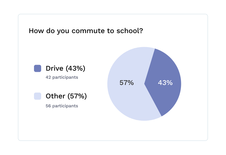
I also sent out a supplementary survey to obtain the overall pattern of the student commute experience. I gathered 98 responses in total and the demographic ranged from ages 18-29.
Key Takeaways 🔎
Although most students use public transit system as their routine transportation means, there are still A LOT of them own a car and drive to school. This led me to think, what if these students could help with the problem of commuting?
HMW StatementHow might we connect people in need with people who can help and create a commuting experience with ease and joy?
IdeationPersona + User Story
To put my bias and assumptions aside, I created primary and secondary personas to remind myself who I essentially design for and what are their frustrations. Due to time limitations, I decided to only focus on the passenger side and design the experience for them in this project.
IdeationChallenges
💡What kind of match-up mechanism should I apply?
To understand how the match-up mechanism is being addressed by other ride-sharing apps in the market, I did a comparative analysis and realized the passengers should have the power and initiative if my goal is to rescue them from passively waiting. Tsuita will provide a match based on route and time for passengers and let them decide.
💡How to keep the cost low for passengers while also provide enough incentives for drivers?
Based on user research, the major pain point of students who drive to campus is parking. Ideally, Tsuita will cooperate will the school, and drivers will get a reserved free parking spot on campus after a successful trip, while passengers don’t need to pay but provide ratings and comments to the driver. Some students also point out the need for meeting new people, so car-pooling might serve as an opportunity for them to develop a further relationship.
DesignConceptualization
Based on the insights I gained from research and ideation, I started creating mid-fidelity mockups for primary use cases.


Refine
Usability Testing + Iterations
Combined with self-critique, the med-fi prototype had experienced several rounds of iterations based on the feedback from users.
Problem 1️⃣ : The homepage is confusing
During the tests, I noticed that most users spend a while looking at the “my week” page (homepage) and trying to understand it. Therefore, I removed some elements and redesigned the layout to make it look simple and self-explanatory.
Homepage redesign
Problem 2️⃣: Match up flow is not intuitive
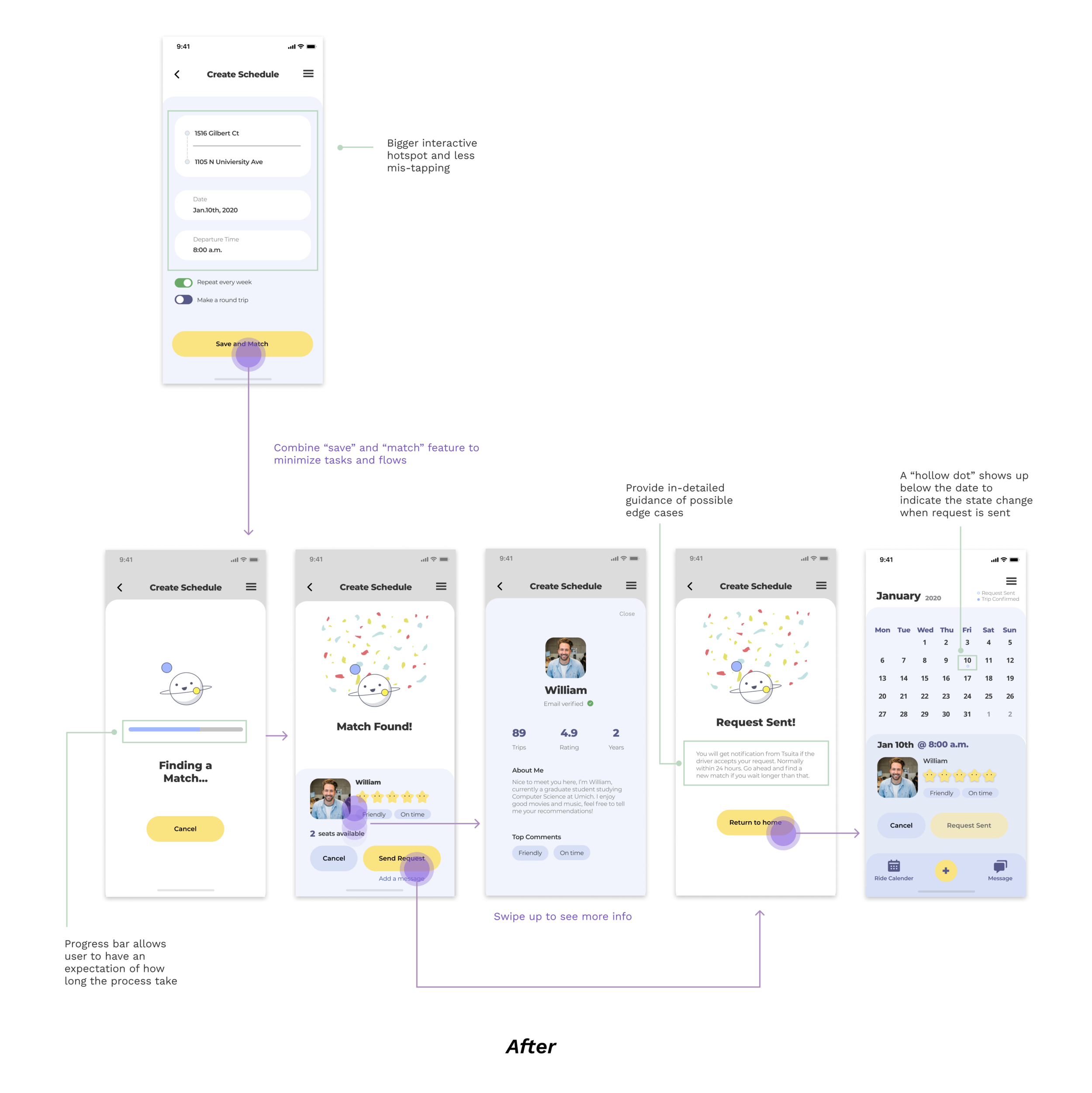
In my initial design, users need to tap “finish” and return to homepage if they want to initiate a match. However, during user testing I found 4 out of 5 participants don’t know how to start the match. Therefore, I redesigned the match up screens and flow with enough guidance to improve the overall usability and affordance.
Final Prototype
Onboarding
Create Account and verify email
Fill in schedule form
Get a match and send request
Chat and check trip details
Reminder before departure
ReflectionFuture Steps
Design for the remaining scenarios to make a complete ride sharing experience
The prototype didn’t cover what users will see on the day when the trip is about to start, and after the ride is finished. For example, should I include a real-time tracker to indicate the location for both passenger and driver to make it easier for them to find each other? What does the screen look like during a ride? Also, how the user flow will be for the passenger to rate the driver after the ride?
Design for the driver side
Although my focus was on the passenger side for the project so far, the driver side is equally important in order to make a smooth ride sharing experience for both sides.
What would I do differently?
Seek out user feedback early and continually
It’s not enough to talk to users only at the very beginning. A concept/idea testing at early stage would be very useful if I reach out to target users after I have my solution in mind. It could allow me to ensure that what I’m going to design is what user want and can really solve their problems. Also, there should be another round of usability testing if all possible after I have my final prototype. There’s no perfect design.
Measure the impact
When I finish my last round of iteration and finally have a polished prototype, I tend to feel the project is officially over. However, it’s not over until I bring my prototype back to the users. If they are happy about it, if they could picture how their commute experience will be improved with my solution, then I could give myself a round of applause - this is when I could say my solution makes an impact.
Thanks for scrolling! Feel free to check out my other projects 🥰
back to home


